thehardestonlineshop.com
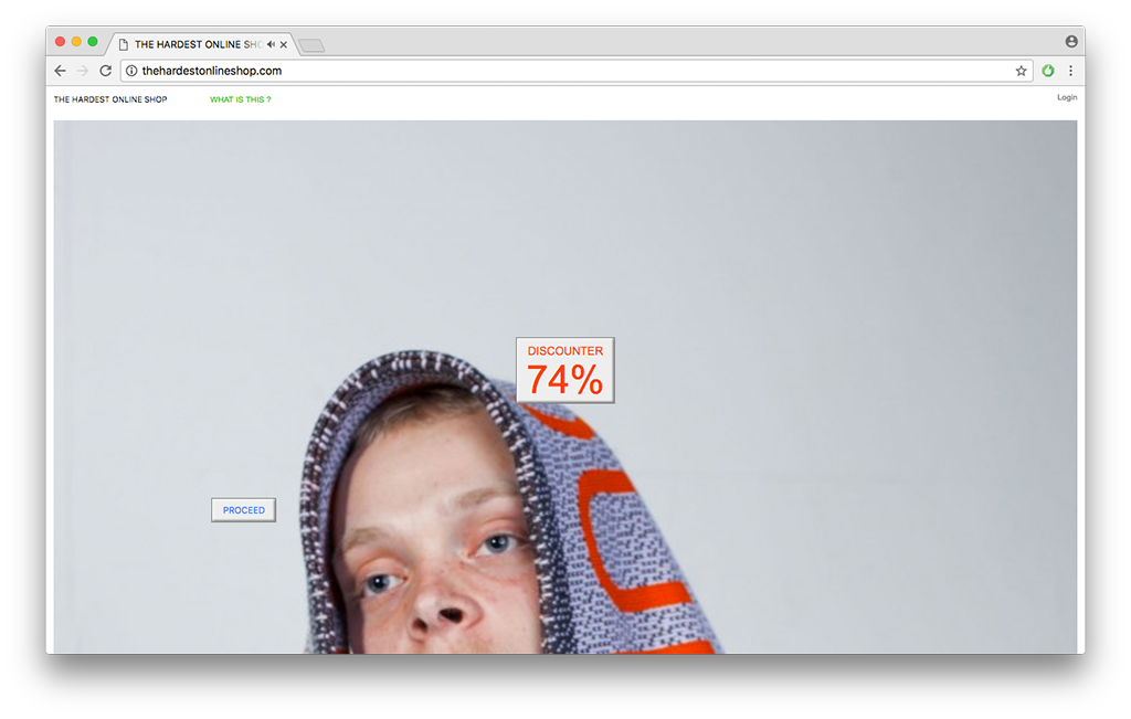
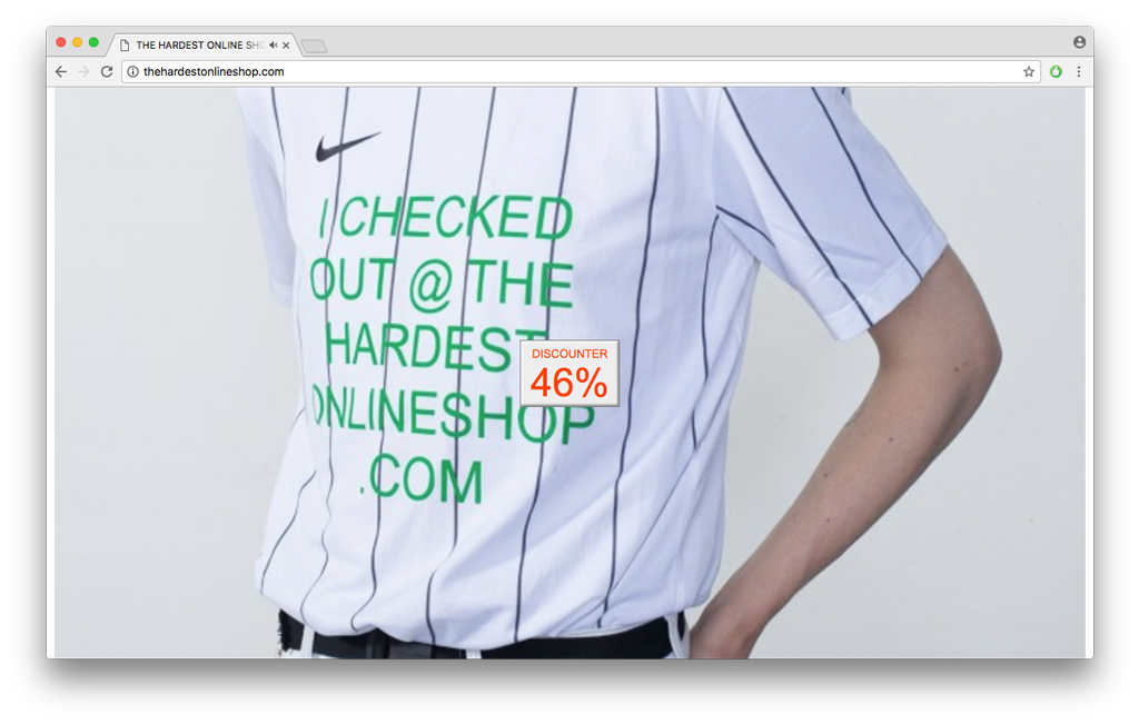
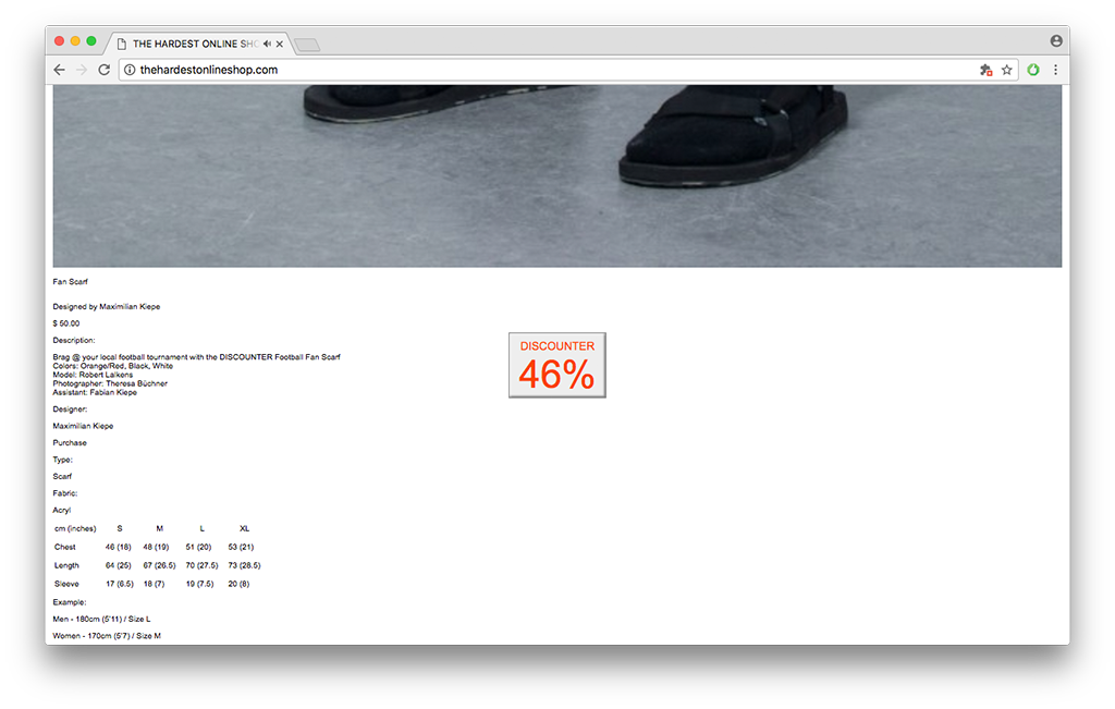
THEHARDESTONLINESHOP.COM is a combination of an Online Shop and an Online Game. By using and embracing Persuasive Design Methods, Dark and Anti Patterns, its goal is it to make it as hard as possible for user to purchase the products. It includes a DISCOUNTER, which is a counter that counts down your discount but works as a timer as well. The DISCOUNTER starts at 100%. If it is 0%, the user has to start all over again. The customer gets the discount he achieved for the product he purchased. Additionally, he gets the achieved discount placed on the product he wants to buy.
Webshops exists to sell products and services to people. They exist because it is more comfortable to search and buy goods from home rather then to go to a shop. Making it as easy and efficient for the customer to buy the products on the website is set as the overall goal for every e-commerce system. Todays webshops are carefully designed to do exactly this but even more. They are, in many cases, also designed to persuade the customer into buying products they actually do not need and trick people into buying or signing up for things that they didn‘t mean to. These methods are called Persuasive Design Methods and Dark Patterns. They make use of psychology, marketing psychology, game theories and social behaviour studies.Sometimes these methods and patterns appear as a mistake in the interface design, but in most cases they are carefully concepted and crafted.
In my project THEHARDESTONLINESHOP.COM I put the idea of Dark Patterns and Persuasive Design Methods in Interface Design vice versa. I wanted to make a website that not hides but embraces these methods and makes it as hard as possible to go through. The outcome is an Online Game/ Webshop, which explores these methods, invents new ones, questions the user behaivour as well as capitalism, e-commerce and marketing strategies itself but also raises awareness on how the user gets manipulated.
My overall dark pattern is the scarcity method. By making it hard to get to the checkout I put a non existing value to the product. I suggest here, that not many people are good enough to get through the shop and therefore provoke a fake limited avaiilabilty of the product. The items get even more attractive by putting the discount on it that you achieve.
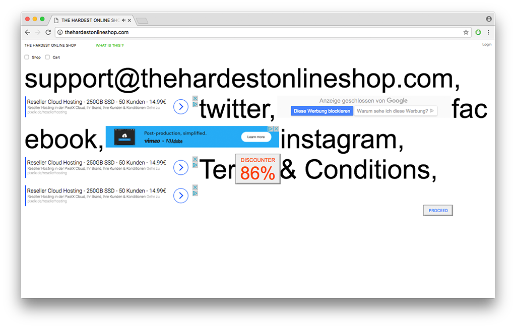 The user experience design of THEHARDESTONLINESHOP.COM basically ignores every rule to ensure a flawless and intuitive user journey. I.e. a series of checkboxes is used in the menu where a dropdown menu would have been the most efficient solution.
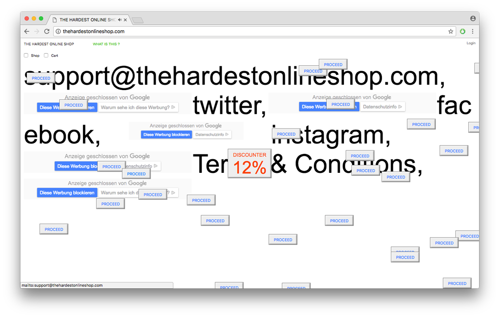
The aestehtic of the website should give the user the feeling that there is constantly sth. wrong. So he always questions his steps. The graphic design and interaction design underlines this with web browser default aestehtics, tiny and huge font sizes, pop ups and Google Ads. 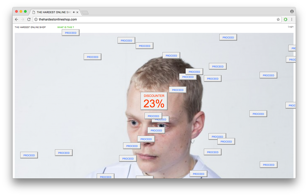
Amongst other I used following Dark and Anti Patterns and Persuasive Design Methods: Scarcity, Bait and Switch, Disguised Ads, Hidden Costs, Misdirection, Privacy Zuckering, Roach Motel, Trick Questions, Big ball of mud, Magic pushbutton and ’Public Shaming’ (a method which I invented during the project).
To see if I achieved my goals send the website to peek.usertesting.com to get it tested. The results of it are documented in the following video:

