Timeline
This thesis has started as a part of Quantified Velodrome project, as an exploration of how technology and design can affect the experience of watching track cycling sports, in particular six day competitions. These competitions have a number of disciplines, in which teams of cyclists compete over the course of six days.
Two core visualizations – Timeline and Scoreboard – were created to address the challenges of today’s viewers and make following the six day races a more insightful experience. Both of them can be used in a variety of contexts – on the screens inside a venue, in broadcasts or in sport news articles/videos.
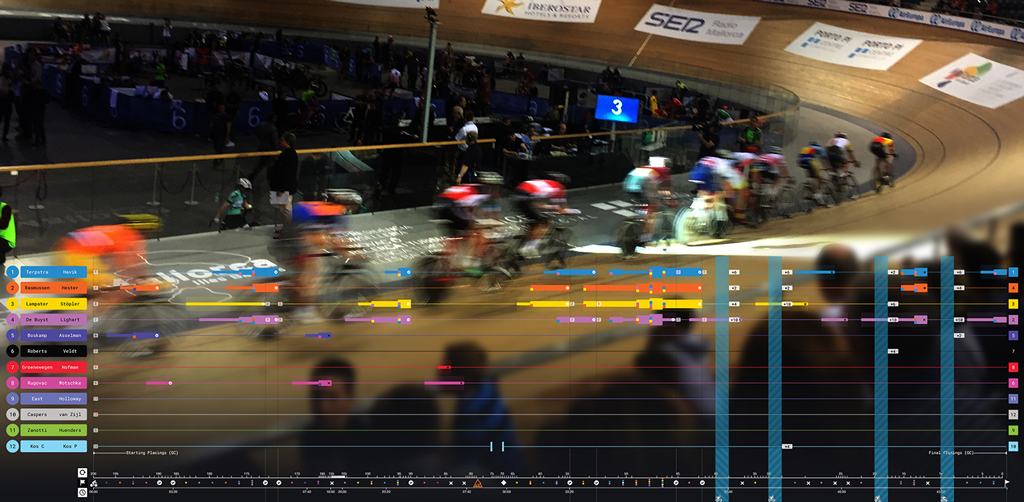
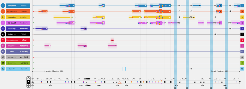
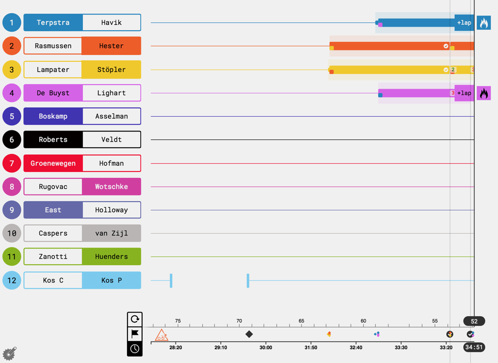
Timeline is a visualization that tells a story of the Madison race – a quintessential and the most complex discipline of 6 day competition. It represents the race as a series of events with one or more teams involved. This visualization can be used to follow the race unfolding in real time or to explore the events of a recorded race. The most important events are attacks, when teams try to win a lap against others. An attack is a process that can have a different number of teams involved on its different stages. Attacks are visualized on a central piece of timeline, giving viewers the possibility to follow the moments of attacks start, joins and splits, successful completion resulting in a lap gain or a failure. Real time data analysis is performed under the hood to display notifications for the teams that might be attacking next.
Timeline also has an infographic version that allows to display or print the whole race as one large visualization, either with a conventional time scale or an event-based one, where time gets warped to show events as evenly distributed time points. This scaling puts emphasis on the variety of events that have taken place during this Madison race.
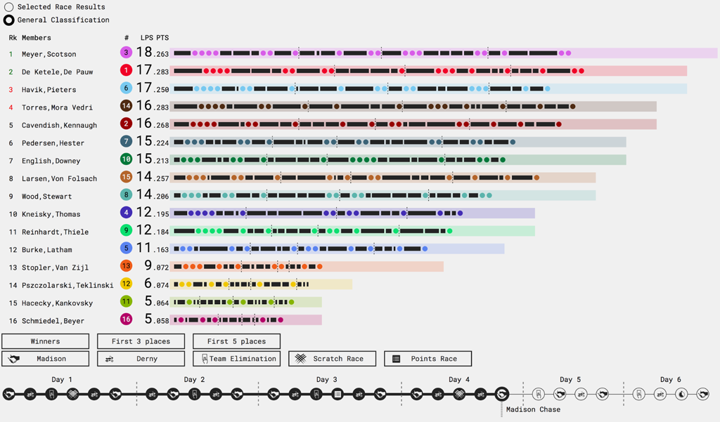
Scoreboard is an enhancement of a conventional leaderboard that can be seen on the venue screens or in live broadcasts. It brings in additional information that is particularly useful for the competitions like six day, that have multiple disciplines and a complex scoring system involved. It displays team dynamics (whether they have moved up or down in the classification) and score history – how many laps and points were gained by a team in each particular race. In interactive contexts (smartphone, tablet, website), the score can be navigated back and forth chronologically and desired information can be highlighted, e.g. such as score gained in particular disciplines, or score that brought team a victory in the race. It allows for such insights as team’s progress during the six days, most crucial races and team’s varying success in different disciplines.